Plan.city app has been developed in-house by AccuCities for its customers. In this this CPD webinar, Brais Brenlla Ramos, the lead UE4 and UE5 developer at AccuCities, will explain how Plan.City works, from the perspective of the tools, the data layer that enables you to use and some of the other functionalities such as being able to navigate the app in different ways and also look at the model that populates the scenes that you will be seeing.
Urban Planning in London using Unreal Engine
Game engines are no longer used “only” for games. Urban planning app Plan.City leverage the power of Unreal Engine to visualise and manipulate a large city environment to answer some of the most common urban planning questions: What other developments are planned around my site? What will my proposed design look like? Where it will be visible from and what impact will it have on surrounding properties? These and many other questions can be answered using the Plan.City app.
Presented by Brais Brenlla Ramos
Lead Plan.City Developer
An architect by training, Brais has been at the forefront of the continuous development of Plan.City, an urban planning app developed by AccuCities. Using a combination of unreal engine blueprints, coding and leveraging existing 3rd party technologies, Brais has imported large-scale 3D city models (London, Detroit, Dublin to name a few) into a game engine, overlaid the city model with various databases and developed a series of tools to rapidly answer some of the most common urban planning questions.
Plan.City webinar transcript
Hello everybody, Welcome to this CPD webinar. My name is Brais and I am the lead UE4 and UE5 developer at AccuCities. Today we’re going to be talking about the Plan.city app which is an app we’ve developed in house at AccuCities. We’re going to be talking about how it works, from the perspective of the tools, the data layer that enables you to use and some of the other functionalities such as being able to navigate the app in different ways and also look at the model that populates the scenes that you’re seeing. It’s a small team that creates this app and some of the tools that we’ve created so far. But we’re always looking towards seeing more additions and we’re relying on your feedback and suggestions for that. The demands that clients have or the suggestions that they have and we take these usually into consideration and whenever we can add anything that might make lives easier we certainly do.
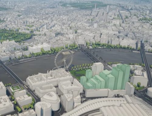
Let’s take a look at the plan.city app at how it works and the possibilities you have when you use it. Before we even talk about any of the tools, allow me to talk about the model that makes up the city and view you’re seeing. What we’re seeing in front of us right now is the London model that we have created in house made out of 2019 imagery. That means that we’ve captured everything that you see using aerial photogrammetry dating back to 2019. This is the second version of our model, the first one was captured in 2016 so we roughly update the model every 2-3 years. And we do this all at once, we take the imagery and we look at the entirety of London and we capture everything once again. So there are no gaps and no discontinuities and no anything that might be made of different datasets. And justg like we did that for this model, we’re also doing that in 2022, so we’re currently working on the latest update of the model. It’ll be the third installment and we’re again using 2022 imagery, so images that are only a few months old and we aim to have that ready by the end of the year. And you can see that all of the areas have all the detail, the roofing detail, the chimney and everything that we capture. There’s a date at the bottom of the screen that’s a different thing because that’s the current date and time. I’m going to change that right now, it looks kind of wintery and I’m going to pretend like it’s august which brings leaves on the trees and the sun.
So this is the entirety of the model and there is a little bit of an asterisk to this. We have kind of like two different models here. The area that you see in front of you is the area that has been captured in the highest detail that we work, so it captures everything and everything is accurate to 15 cm. Here we mostly see the roof detail but we can also produce other products that also contain facade details and extra things like textures and materials and things like that. And on the edge of the model is something we call a background model, this extends for thousands of square kilometers around it. And it’s made out of a more simplified model, you can probably see the boundary or the edge, which is our model captured in all of its glory and then the background model that we have created through automatic techniques. That is quite accurate but obviously not as accurate. Now, the 2019, 2016 or the upcoming 2022 one is accurate to 10-15 cm across the entirety of the area we captured which is roughly 80 km square. From Canary Wharf to the City of London, Hide park and so on. Those are the areas that fall into the 80 km sq. You can see that the area also captures assets such as trees and their height and their width, and these trees are also quite accurate in terms of their presentation. Something else I can probably show within this app is what we call the level 4 models. These buildings that show a bit more details, are a bit more bespoke. Such as The Shard or the Walkie Talkie. We create many different buildings like this but we can’t always include them here. Because at the end of the day what we use this app for is presentation purposes but also for creating tools that allow our clients to conduct studies or different proposal projects within the app.
Having said that, let’s have a look at another dataset. It’s the future skyline, we capture according to the planning application or all of the information that we can gather. And if I scroll this over there and show TBD layers, you can see visual representation of all of the buildings that are going to appear in the future. And if we click on any of these tags we will be able to retrieve information about these buildings such as the name of the building, its status if it’s currently under construction or what the finishing year is expected to be or the architect. We provide this for our clients so that they can make decisions based on that, and see how this will affect their project. So this is another of the datasets that we offer alongside the existing building app. That’s all I have to say in regards to the datasets and the models.
Let’s move on to the navigation part, the data layers and the tools that we provide within the app. If we take a look at the panel of the app there are 3 different areas. Navigation, Data layers and tools. We provide different functionalities through these different panels. Navigation is one of the first panel you probably want to go through, so you can navigate through the app in different ways or also create a presentation or look for a particular postcode. If you know the building you want to visit, you can type its postcode and just navigate that way. Then data layers is a section that contains all the datasets that we could get our hands into. That goes beyond what we capture. Things like flood analysis, the future skyline, historic England or protected views and PTAL(Public transport Accessibility Layer) and so on. And finally we have the tools section where we included things such as the building tool, the import and export functionality and viewshed tools. All of those functionalities we created ourselves that provide different insights and different information for our clients. We highly appreciate any suggestions, or anything we can add to the app that can be useful to any of our users. There is also a 4th panel, which we call a setting panel where you can control the time and date, the speed at which you fly throughout the app , graphic setting, documentation so we also have a comprehensive list of the tools and the data layers. That’s an overview of the functionalities, so let’s have a look at what each of them do individually.
First if you go the the navigation panel, we have several options available to us. Drone mode, overview, walking those 3 different navigation or control systems that we included. Currently we’re playing the drone mode, the drone mode is a flying system. Lets you basically move around however you want, you can go up down, look wherever you want at any given angle so you’re not restricted in any way and fly through the city. The overview follows a similar logic. It’s most similar to Google maps style of navigation, or a 3D app environment where you are kind of locked to top down perspective. You can always navigate and move around the map and change the angle of a camera, but you are limited up to a certain degree. It’s a bit more locked as an experience. Then again, tailor made for other devices. And the last one is walking mode, which is a system that lets you basically place a human character anywhere you want, even on top of a building if you want to do that and just navigate the model as if you were a pedestrian. With the human character you can navigate the city as if you were walking around in a video game, you can jump, you can switch into first person mode, which is also a good option if you want to work within the interior of the app. It lets you visualize everything in the highest detail. It’s a great fit for any VR headsets, you might want to use within the app. Basically that’s what it does, it puts you in the shoes of a human, so you can better view the picture of a built environment. It gives a better sense of scale.
That’s it for the tree different navigation that we have. We also have other tools within that same section, for example the presentation panel allows us to create new presentations. You can give it a name and then we can add slides to the presentation. Adding slides means that you include new camera positions that you can then navigate. Maybe if you want to focus on one building and view the building from different angles and create a narrative around that. Then you can save the presentation and some other day when you come back to the app you can go to today’s presentation and view it. You can also hide the user interface and you can use this with a combination of some of the other tools later on. Such as the import function to bring your own building or the inventory system. You can export images out of the app just to create visuals for your own project. Now, the go t button is a simple system that allows you to quickly navigate different areas. We have Canary Wharf, Hyde Park, Imperial War Museum, London Eye. And this quickly allows you to navigate these areas. We can view Saint Paul’s cathedral at the press of a button. There are many different ones, evenly spaced throughout the 60 -80 sq km of the model. And the postcode search lets you type in any postcode and it will navigate according to that. So this is just another way to navigate the model.
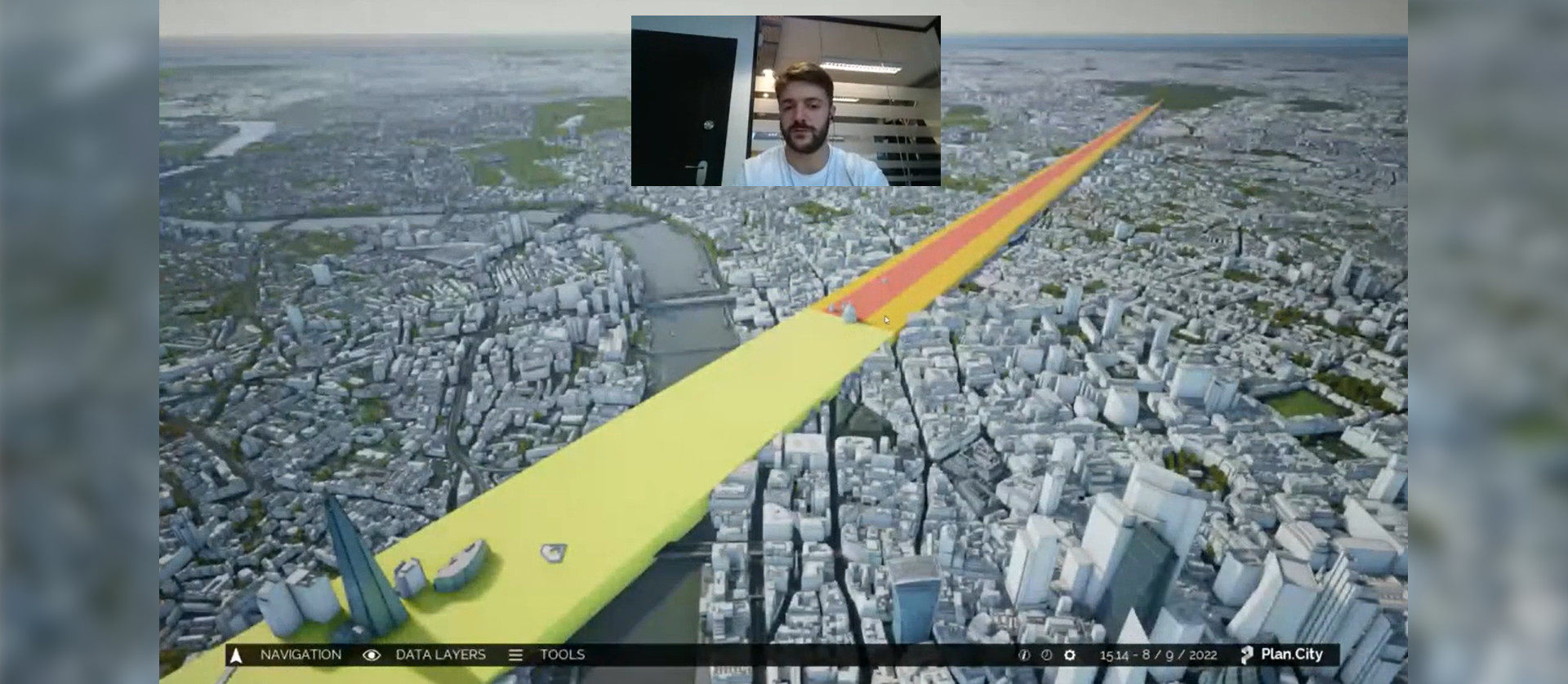
We can move on the data layers. It’s a panel that allows you to visualize some of the data that we captured and retrieved. Boroughs database is just something that will list all of the boroughs within London it will show you their name. Imagine you’re a construction company and you need to find the edge of the borough. Then the flood analysis. If we toggle it, you’ll be able to see that we’ve painted the model according to the flood map provided by the UK public data government. It shows different flood zones areas that we have across London. The future skyline is the one we saw before, listing all of the future buildings that will happen in the coming years. Historic England, is a rather interesting one especially for London, because if we click on it we will be able to display those buildings across London that are subject to some type of protection. So for example we have many of them in central London. And we can click on them just like the future skyline ones and it will give us the name of the building date amongst other information about the building. Then we have the protected views which are just a recollection of different views that we included here that show images or views that need to be protected. For example views focusing on St. Paul’s or the Shard. The pictures that we retrieved from the LVMF documents that define these protected views dating back to 2012 I think. This is also an opportunity for me to show the accuracy of the model. And we’ve created 3 different views. Then we have PTAL – public transport accessibility levels. It shows how easy or how difficult it is to hop on public transport in London. Then we have St Paul’s height grid, this gives the height of St Paul’s so we wouldn’t be able to create a construction higher than that. This gives us a good approximation on how tall our developments can be.
We also have traffic cameras, this is an example of live data that gives us the current live images of those cameras that are working. Here is the Tower Bridge camera, this gives us a 10s look for safety reasons. Next are the tube lines, which show us the tube line around London and the different stations the services that they provide. Viewing corridors are similar to the protected view that you saw before, in fact they come from the same document. This dataset tells us how high the building can be within the whole model also in distance. It’s divided in 3 colors, red, orange and yellow and that tells us how important the area is, so for example the red area means that you wouldn’t be able to build anything taller than this. And the last dataset that we’re going to look at in this section is the air quality data. It is an example of a live database that we enquired to know the quality of air that we breath and recorded by several stations. You can see those little green clouds that started to appear and if we click on it you can see certain pollutants up here on top of the clouds. So for example I clicked on the City of London Walbrook Wharf weather station and it recorded the NO2 pollutants and it’s giving us the quality index of 1. This means that the quality of the contamination of that particular cloud is good. The quality index goes from 10-0, where 10 is really bad. So those were all databases, that’s information that already exists we just translate it to the application, to Plan.city.
But what about doing new and interesting things with the data, that’s what the tools panel stands for. And we’ve included several tools and are always looking for more. But these are the tools that we have for now. We’re going to take a look at them now individually. Measurement tool, that basically does what it says. It gives you certain options to measure the buildings. First we have a point-to-point option, that allows us to click on several parts of the model and give us the distance between those points. It’s a 2D distance, that means that it doesn’t take into account the height difference. Walking distance is a system that quickly highlights how long it would take for a pedestrian to walk somewhere. Then we have a height check that allows users to create a ruler that they can place anywhere in the model and check the height of a building. Those were the measurement tools, then we have the builder tools. Which allows users to quickly sketch something. If they want to create a simple shape they can just sketch it. They can choose a particular height and they can close the roof if they want to and then they can export these designs into an external 3D space. But this gives you the ability to quickly sketch something. If you use the import/export option, you would try to export the model that would create and fbx. With the shape that you saw. And just like we’re using this sketch mode to export something out the app we could also use the import function to bring something in. Let’s say Ive created a building in this particular location, so we can just hide an existing building and bring something new in. If I go to the import function, and import a building I created before, you can see that that places my building inside the app. That is a way of refining and creating buildings that we can bring into the app and where you can modify the materials. It’s just a way to work with your design. We can also use this building with the walking mode and just walk around your own design. Next we have a view-shed tool, which analyzes or gives you an idea of where the building is going to be in visible form. We’ve created this quick sketch before, and now I want to know where the building is going to be visible from. And then it just runs a simulation which gives us the idea and it will paint yellow on the places from where the building will be visible from and the other areas where we can’t see the building from. We can take a screenshot from above if you want to export the results. And finally you can delete the simulation or use the walking character so you can check the results. As soon as we step into the yellow area we should be able to see the building. That’s basically how this works.
Let’s analyze some of the other tools that we have. Let’s try to run the sky analysis. It analyzes a particular building and it tries to determine how easy it is for a given point from a building to see the sky. So let’s run the analysis. It will paint the facade of the building, it will paint how well you can see the sky from a certain point. If it pays in green because there aren’t any other buildings around it that obstruct it to see the sky. There aren’t any obstacles. But if we look at the other side there is also yellow and some red mainly because there is a big building which obstructs the view. So this is very useful for some of our clients. Next we can move on to the sunlight analysis and this will give us an idea of how much sunlight a volume received through a period of time. The volume that we’re going to analyze is made of these tiny boxes, or points that are going to be the locations that are gonna be analyzed. They are basically gonna be looking at the sun and retrieving how many of those points can see it for a particular time of day. And that will give us an idea of which areas are more likely to be lit. The second part of the analysis is that you can choose the date and the time, the period in which you would like to analyze the building. The bright yellow ones are the point where you can clearly see the sun. However if we focus on the lower part of the building where we can see some purple color which lacks sunlight. So you might want to conduct design choices according to this analysis. We can also store this analysis on a disk if you want to review it later on. Then the inventory system is a way for us to quickly give access to different built models around the scene. Building blocks, street furniture, vehicles, letters and numbers. These come useful if you decide to create scenes. If we want to place a bench over here or more trees we can do so. You can do whatever you can imagine with these tools. And then finally we have the quick screenshot tool which does what it says. It takes a screenshot and from a particular area, it captures what we’re seeing. And these are the tools that we have at our disposal right now.